Led Example
Files:
Description
The LED example exercises the LED API, it demonstrates how to manipulate the device led with various colors and flash counts.
Overview
In this example we'll learn how to use the Led object to change the device led color and the flash count.
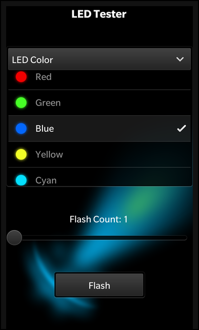
UI
The UI of this sample application consists of a DropDown that represent the various led color selections, a Slider bar to change the flash count and Button to start and stop a flash cycle.
The business logic of the application is encapsulated in the Led component which is exposed as Led custom component to the UI.
    DropDown {
        id: colorChooser

        topMargin: 100
        horizontalAlignment: HorizontalAlignment.Center

        title: qsTr ("LED Color")

        Option {
            text: qsTr ("Red")
            value: LedColor.Red
            imageSource: "asset:///images/red.png"
            selected: true
        }

        Option {
            text: qsTr ("Green")
            value: LedColor.Green
            imageSource: "asset:///images/green.png"
        }

        Option {
            text: qsTr ("Blue")
            value: LedColor.Blue
            imageSource: "asset:///images/blue.png"
        }

        Option {
            text: qsTr ("Yellow")
            value: LedColor.Yellow
            imageSource: "asset:///images/yellow.png"
        }

        Option {
            text: qsTr ("Cyan")
            value: LedColor.Cyan
            imageSource: "asset:///images/cyan.png"
        }

        Option {
            text: qsTr ("Magenta")
            value: LedColor.Magenta
            imageSource: "asset:///images/magenta.png"
        }

        Option {
            text: qsTr ("White")
            value: LedColor.White
            imageSource: "asset:///images/white.png"
        }
    }
The application initializes the DropDown with the different Options to allow the user to set the device led color. For the 'value' property we use the LedColor enums, so that we can bind the 'selectedValue' property of the DropDown directly against the 'color' property of the Led object later on.
    // Slider which allows you to choose flash counts
    Slider {
        id: slider

        property int normalizedValue: (Math.floor (value) == toValue ? -1 : Math.floor (value))

        horizontalAlignment: HorizontalAlignment.Fill

        fromValue: 1
        toValue: 10
        value: 1

        enabled: !ledID.active
    }
The slider is initialized in the range of 1 to 10, which allows a user to select a flash count for the led. The custom property 'normalizedValue' is used to access the current value rounded to an integer. If the user has selected the maximum value, '-1' is returned, which represents the infinite flash count.
    // A standard Button to activate LED flash
    Button {
        topMargin: 100
        horizontalAlignment: HorizontalAlignment.Center

        text: ledID.active ? qsTr ("Cancel") : qsTr ("Flash")

        onClicked: {
            if (ledID.active) {
                ledID.cancel ();
            } else {
                if (slider.normalizedValue == -1) {
                    ledID.flash ()
                } else {
                    ledID.flash (slider.normalizedValue)
                }
            }
        }
    }
There is a single button to start and stop a flash cycle. The text of the button depends on the current state of the Led object.
    // Led component
    Led {
        id: ledID

        color: colorChooser.selectedValue
    }